Have you been searching for a paint shade that’s both bold and subtle at the same time? Dark colors can completely transform a room, and Benjamin Moore Wrought Iron (2124-10) deserves your attention. I’ve used it in my own home and have seen firsthand how powerful (and surprisingly versatile) this color can be.
This isn’t just about hex codes and swatches—you’ll see how this shade behaves in real rooms, what makes it unique, and the best ways to use it without regrets.
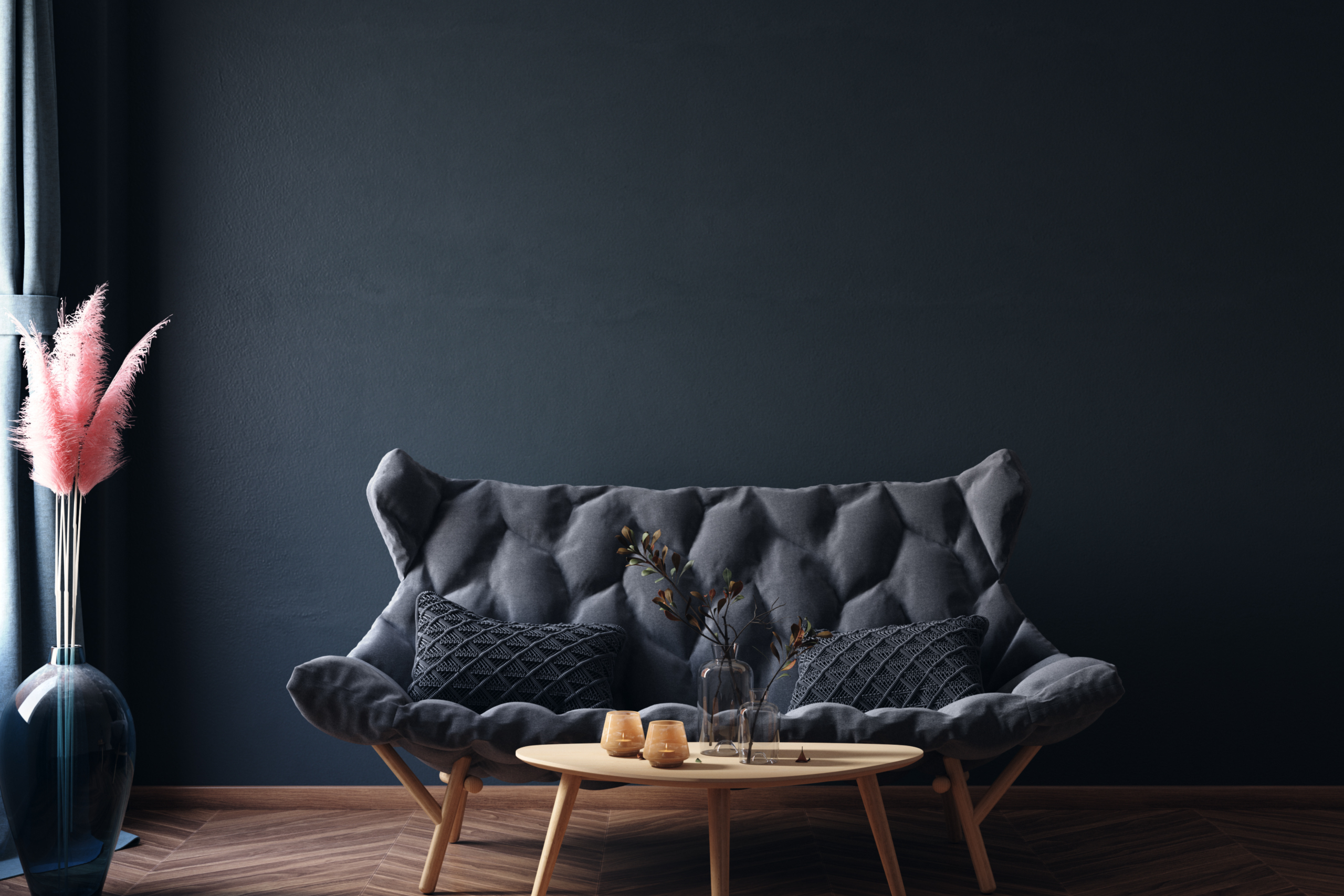
Why Wrought Iron Isn’t Just Another Black
The first time I tested Wrought Iron, I realized it’s not flat black. Instead, it’s a complex mix of charcoal, navy, and soft black that shifts throughout the day.
With an LRV of 8.17, it absorbs a lot of light, but not in a way that feels dead or heavy. Morning light teases out faint navy undertones, while dimmer spaces lean into its charcoal depth. This shifting personality gives walls a dimension that a true black paint can’t match.
If you want to understand the depth, don’t just rely on paint chips. Put a sample on different walls and watch how it changes with the light. That’s where you’ll see its real magic.
The Mood Wrought Iron Creates
One of the biggest reasons I recommend Wrought Iron is how it changes the feel of a room.
- In small spaces, like a powder room, it creates intimacy and coziness.
- In larger rooms, it blurs the edges, making walls feel endless rather than closed in.
- In reading nooks or bedrooms, it delivers calm, almost cocoon-like comfort.
I painted my own reading nook in Wrought Iron, and instantly, the brass lamp popped more, the bookshelves stood out, and the whole corner felt curated.
Why Wrought Iron Works Almost Anywhere
What sets this shade apart is its versatility. It bridges styles effortlessly:
- In modern homes, it feels sleek and clean.
- In farmhouse kitchens, it looks natural on island cabinets.
- As an accent wall, it draws the eye without overwhelming the space.
One of my neighbors painted her entire office in Wrought Iron. She described it as “disappearing” into the background so she could focus better. On the flip side, I’ve used it sparingly—just one dining room wall—and it became the star of the space.
Because of its subtle undertones, it pairs beautifully with:
- Warm woods
- Cool stone
- Brass or chrome fixtures
- Crisp whites or soft creams
This adaptability means you don’t need to repaint when you change your furniture or décor.
For contrast, pairing Wrought Iron with a lighter shade like Sherwin Williams Upward creates a striking but balanced look.
Best Places to Use Wrought Iron
Here are three areas where I’ve seen Wrought Iron really shine:
1. Bedroom Walls
Dark walls can feel surprisingly restful. Wrought Iron creates a cozy, peaceful vibe at night and shows off hints of blue in the morning light. If you’re hesitant, start with an accent wall behind the bed.
2. Kitchen Cabinets
When paired with white uppers, Wrought Iron lower cabinets ground the entire kitchen. Countertops—whether marble or butcher block—pop against the dark base, giving your kitchen a high-end feel without a remodel.
3. Bathroom Vanities
A boring vanity instantly becomes a feature piece. In my guest bathroom, two coats of Wrought Iron turned the vanity into something guests always notice. It works with almost any fixture finish, from chrome to brass.
Wrought Iron vs Other Benjamin Moore Dark Colors
If you’re deciding between Benjamin Moore’s popular dark shades, here’s how Wrought Iron compares:
| Color | Undertones | Best For | Choose It When… |
|---|---|---|---|
| Wrought Iron | Navy blue, charcoal | All-purpose, adaptable | You want a softer black with depth and character |
| Kendall Charcoal | Warm green-gray | Cozy, traditional spaces | You prefer something earthier and lighter |
| Cheating Heart | Charcoal with brown hints | Wood-heavy or classic rooms | You want warmth without any blue |
| Black Beauty | Pure black | Modern, high-contrast designs | You want no undertones—just true black |
For me, Wrought Iron wins because it’s more flexible than Kendall Charcoal (which leans green) and less stark than Black Beauty.
If you’re considering other dark tones, Sherwin Williams Peppercorn is another popular choice with slightly different undertones.https://outdoortag.com/peppercorn-sherwin-williams-the-complete-guide/
Final Thoughts
After living with Wrought Iron for over a year, I can say this: it’s bold without being harsh, dark without being flat, and timeless without being boring.
Whether you use it as an accent wall, on cabinets, or for an entire room, it brings sophistication and depth that few other colors match. Just be sure to test it first—you’ll notice how it shifts throughout the day, and that’s what makes it so special.
If you’re looking for a paint color that adapts to different rooms, design styles, and lighting, Benjamin Moore Wrought Iron should be at the top of your list.