Want to use one of the most versatile dark paint colors on the market? Then you need to know about peppercorn Sherwin-Williams (SW 7674). This deep charcoal gray has become a go-to choice for designers and homeowners alike because it delivers bold drama without the harshness of pure black.
In this guide, you’ll learn everything about Peppercorn: its LRV, undertones, best color pairings, and exactly where to use it in your home. Let’s dive right in.
What Makes SW Peppercorn Different?
Here’s the deal: Peppercorn (SW 7674) isn’t your typical gray paint. It sits in that sweet spot between charcoal and black, dark enough to make a statement, but soft enough to work in multiple settings. The result? A sophisticated color that adapts to both modern minimalist spaces and traditional homes.
You can use it on interior walls, kitchen cabinets, exterior doors, and trim accents. It works equally well in contemporary lofts and classic farmhouses. Bottom line: It’s one of the most flexible dark colors you’ll find.
The LRV Factor (This Matters)
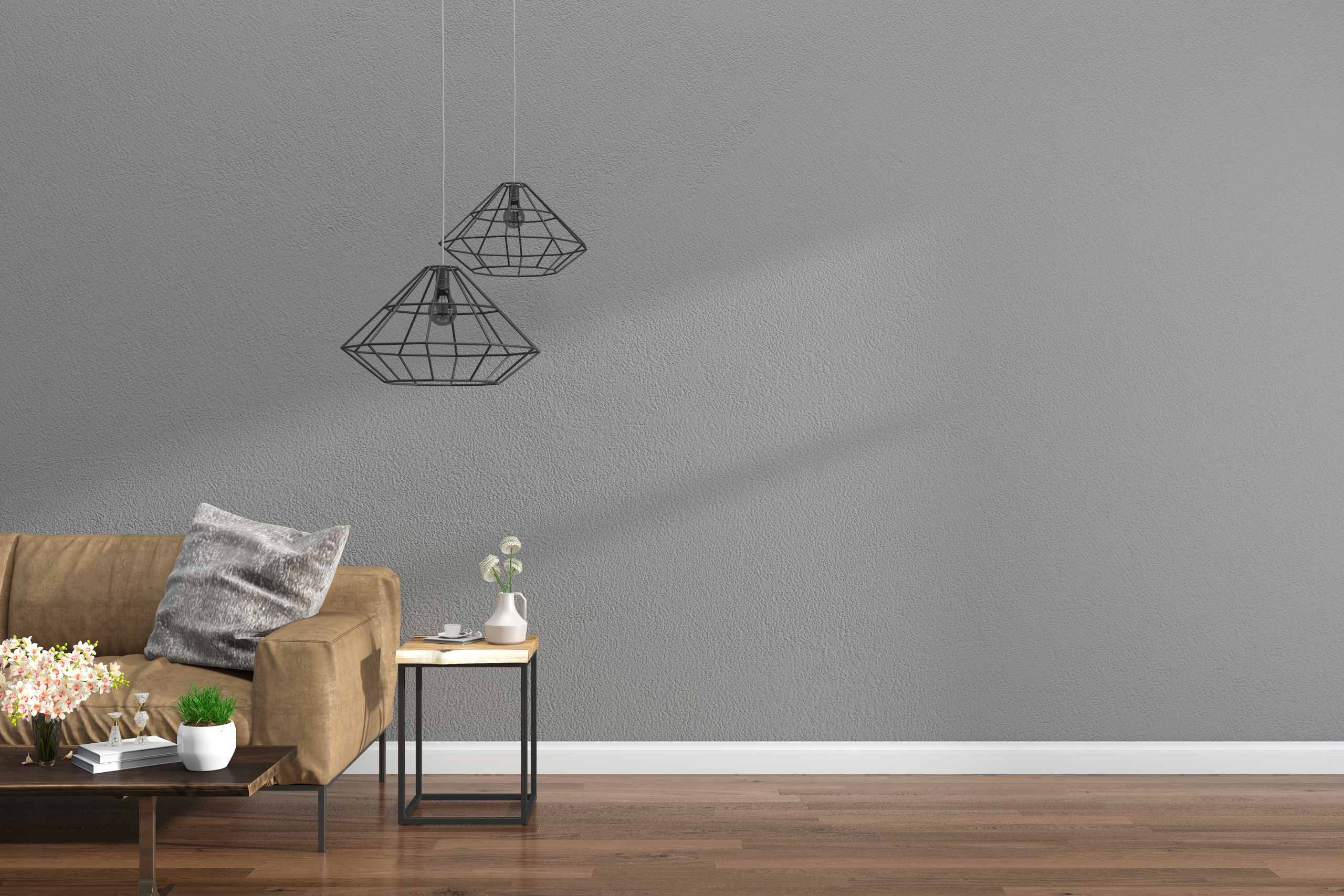
Let’s talk numbers. Peppercorn has an LRV of 10, which means it reflects only 10% of available light. In small or dark rooms, Peppercorn will make the space feel smaller and darker. But here’s the good news: In bright rooms with ample natural light, it creates a rich, inviting atmosphere that feels intentional and upscale.
Pro tip: Use Peppercorn as an accent color in darker spaces rather than painting all four walls. This approach gives you the drama without overwhelming the room. Consider using it on a single feature wall or as a trim color instead.
Understanding Peppercorn’s Undertones
Here’s something most people miss: Peppercorn’s undertones can shift depending on lighting conditions. The base is neutral gray, but you might notice hints of blue in certain lighting or purple in other conditions. The key takeaway? Always test this color at different times of day in your specific space.
Why this matters: Peppercorn’s chameleon-like quality is actually a strength. It means the color works with both warm and cool color schemes. This versatility makes it easier to integrate with existing furniture and decor.
How Lighting Changes Everything
This is critical. The same can of Peppercorn will look completely different depending on your lighting situation. In north-facing rooms, the color appears cooler and more gray, while in south-facing rooms, it warms up slightly with natural sunlight.
If you’re curious about how Sherwin Williams Upward behaves under different lighting, check out our Sherwin Williams Upward color guide
LED lighting creates a different effect than incandescent bulbs. The color also shifts throughout the day from morning to evening. Here’s what to do: Paint large samples on your walls and observe them for at least 24 hours before committing. This simple step will save you from costly mistakes.
The Best Color Pairings for Peppercorn
Let’s break down the color combinations that actually work.
Pairing #1: Bold, Rich Colors
Peppercorn creates stunning combinations with deep, saturated hues. Colors that work include deep emerald green, navy blue, and rich burgundy. The secret sauce? Add white or light gray accessories to balance the intensity and prevent the space from feeling too dark.
These bold pairings work best in spaces with excellent natural light. Without adequate brightness, the combination can feel heavy and oppressive. Make sure you have plenty of windows or strong artificial lighting before committing to this approach.
Pairing #2: Crisp Whites and Creams
Want a modern, timeless look? Pair Peppercorn with Sherwin-Williams Pure White. The contrast is perfect: clean and sharp, modern yet classic, high-impact without feeling cold. This combination has been trending for years and shows no signs of fading.
Example: Paint your kitchen island Peppercorn and keep the upper cabinets Pure White. The two-tone approach creates visual interest while maintaining balance. One caveat: Test cream colors carefully, as some can clash with Peppercorn’s cool undertones.
Another timeless neutral worth considering is Swiss Coffee by Sherwin Williams, which pairs beautifully with darker shades like Peppercorn.
Pairing #3: Warm Neutrals
Here’s a winning combination: Peppercorn plus warm beige tones equals inviting, grounded spaces. Top pairing: Peppercorn with Accessible Beige. This combo works especially well in living rooms, bedrooms, and spaces with abundant natural light.
The warm neutrals soften Peppercorn’s depth while maintaining visual interest. This approach creates a cozy atmosphere that feels sophisticated rather than stark. It’s ideal for homeowners who want drama without sacrificing warmth.
Peppercorn vs. Other Popular Dark Grays
Let’s compare Peppercorn to similar colors so you can make the right choice.
Peppercorn vs. Iron Ore
Iron Ore runs warmer and darker than Peppercorn. When to choose Peppercorn: You want a softer, more versatile look, you’re working with both traditional and contemporary elements, or you need flexibility with color pairings. It adapts better to different design styles.
When to choose Iron Ore: You prefer a bolder, more modern aesthetic, and you want maximum drama. Iron Ore makes a stronger statement but offers less versatility. It’s the better choice for ultra-contemporary spaces.
Peppercorn vs. Urbane Bronze
The main distinction: Urbane Bronze has noticeable brown undertones while Peppercorn stays true to its gray base. Choose Peppercorn when you need a color that works with warm and cool schemes. It’s ideal when you want a cleaner, more neutral gray or your existing furniture leans cool-toned.
Choose Urbane Bronze when you want a cozy, earthy feel. It’s perfect for creating warm, traditional spaces with natural wood elements. Urbane Bronze brings more organic warmth to a room than Peppercorn ever could.
Peppercorn vs. Grizzle Gray
Here’s the breakdown: Grizzle Gray is lighter and slightly warmer than Peppercorn. In fact, it’s one shade lighter on the same Sherwin Williams color strip. Peppercorn works best for statement walls, bold accents, and contemporary spaces where you want maximum impact.
Grizzle Gray suits spaces where you want a softer touch. It’s the better choice for traditional homes or rooms where you need less drama. Think of Grizzle Gray as Peppercorn’s gentler cousin.
Where to Use Peppercorn (Specific Applications)
Let’s get tactical about where this color shines.
Application #1: Feature Walls
The strategy: Paint one wall Peppercorn and keep surrounding walls lighter. Choose a wall with good natural light or architectural interest, like a fireplace or built-in shelving. This creates a focal point without overwhelming the entire space.
Make it work by adding mirrors or metallic decor to reflect light. Use light-colored furniture and textiles throughout the room. Install bright curtains and area rugs to maintain balance. The result: A balanced space with visual drama that doesn’t feel heavy.
Application #2: Kitchen Cabinets
This is where Peppercorn really shines. Winning formula: Paint the island Peppercorn, keep perimeter cabinets white or light gray, add light countertops like marble or white quartz, and install brass or chrome hardware. The contrast creates an upscale, custom look.
Bonus tip: Incorporate natural wood elements like butcher block counters or open shelving. The mix of dark cabinets, light surfaces, and natural wood creates depth and interest. This approach has become increasingly popular in high-end kitchen designs.
Application #3: Dining Rooms
Peppercorn transforms dining rooms into sophisticated entertaining spaces. The color makes both light and dark wood furniture look more expensive and intentional. Essential elements include a statement light fixture that creates beautiful shadows and ample lighting from natural or overhead sources.
Add light-colored chairs or upholstery to prevent the space from feeling too enclosed. The effect: Cozy and intimate without feeling cramped. This works especially well in formal dining rooms where you want to create an elegant atmosphere.
Application #4: Exterior Use
Don’t overlook Peppercorn for outdoor applications. Top exterior uses include front doors for instant curb appeal, shutters, and trim work. It pairs beautifully with light brick, dark brick, natural stone, and white or cream siding.
Critical step: Test large samples on different sides of your house to see how sunlight affects the color throughout the day. East-facing surfaces will look different from west-facing ones. What looks perfect in morning light might appear too dark by afternoon.
FAQ: Your Top Peppercorn Questions Answered
Is Sherwin Williams Peppercorn Warm or Cool?
Short answer: Neither. Peppercorn sits in the neutral zone and adapts to either warm or cool depending on your space’s lighting and surrounding colors. This flexibility is actually one of its biggest strengths and why it works in so many different design schemes.
What Color is One Shade Lighter Than Peppercorn?
Grizzle Gray (SW 7068) is the official “one shade lighter” option on the Sherwin-Williams color strip. It maintains a similar style while offering less drama. Perfect if you like Peppercorn’s vibe but want something softer or more approachable for your space.
The Bottom Line
Peppercorn SW 7674 stands out as one of the most versatile dark paint colors available. Key takeaways: LRV of 10 means it needs adequate lighting, it works with both warm and cool color schemes, always test in your specific space before committing, and it pairs beautifully with whites, creams, and warm neutrals.
Next steps: Order a sample, paint it on your wall, and watch how it changes throughout the day. That’s the only way to know if Peppercorn is right for your space. The investment in a sample can save you from an expensive repaint down the road.