Choosing the right paint color can shape the atmosphere of a room and influence how a space feels. Sherwin-Williams offers a wide range of shades, and one that stands out is Upward (SW 6239). This soft blue with a hint of gray provides a calm and adaptable look that works well in many settings.
Upward has the ability to bring a light, airy quality to interiors while still blending smoothly with other colors and design styles. Its versatility makes it a reliable option for both interiors and exteriors, offering a balanced backdrop that feels fresh without being overwhelming.
Key Takeaways
- Upward creates a calm and adaptable atmosphere
- The shade works well in different rooms and exterior spaces
- It pairs easily with a variety of other colors
What Makes Sherwin Williams Upward Stand Out?
1. Gentle Blue with a Calm Presence
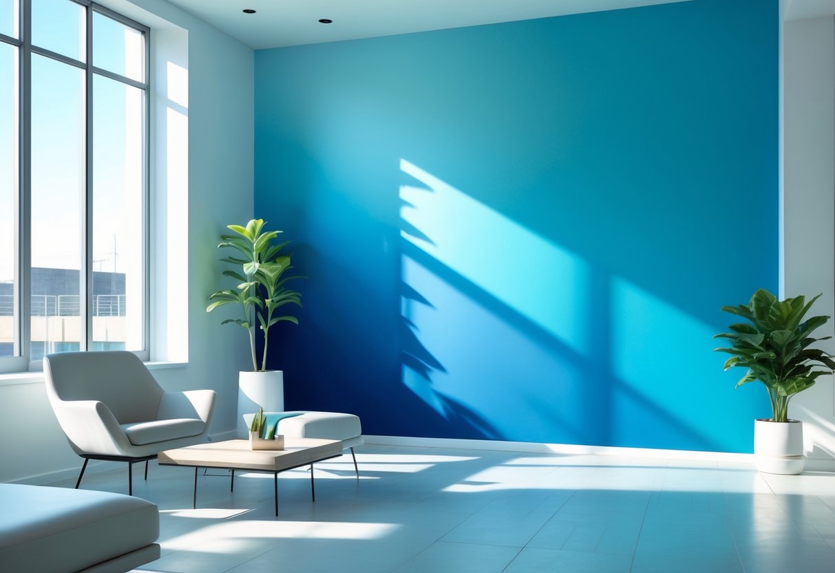
Sherwin Williams Upward (SW 6239) carries a light blue shade that feels calm and easy on the eyes. Unlike brighter blues, it has a soft quality that avoids looking too bold or overwhelming.
The color includes a touch of gray, which gives it a more refined look. This subtle mix helps it work well in spaces where people want peace without the color feeling too cool or too playful.
Many find that this shade can create a relaxing effect in living rooms, bedrooms, or offices. It offers a sense of balance that makes a space feel open yet grounded.
Key traits of this tone:
- Light and airy appearance
- Gentle gray undertones
- Works well in both small and large rooms
2. Flexible Use Across Different Styles
Upward fits into many design styles, from coastal to modern. In a beach-inspired setting, it pairs well with sandy neutrals, light woods, and crisp whites. This combination creates a clean and refreshing look.
In farmhouse or rustic spaces, the color blends with darker beams, metal fixtures, and natural textures. Instead of clashing, it softens the overall design.
Even in urban or minimalist homes, it adds just enough color to break up neutral palettes without overpowering them. Its ability to adapt makes it useful for designers who want consistency across different rooms.
Examples of pairings:
| Style | Works Well With | Effect Created |
|---|---|---|
| Coastal | White trim, driftwood, sandy beige | Light and breezy |
| Farmhouse | Dark beams, black hardware | Warm yet calm |
| Minimalist Loft | Concrete, steel, neutral fabrics | Subtle color without weight |
3. A Mix of Warm and Cool Hues
One of the most distinctive features of Upward SW 6239 is its ability to shift with lighting. In the morning, it can look slightly warmer with a soft glow. By midday, it settles into a balanced blue that feels steady and neutral.
As the evening light changes, the shade deepens and creates a cozy atmosphere. This quality makes it feel adaptable throughout the day, offering comfort in different settings.
It also works with a wide range of materials. Warm woods, cool marbles, and mixed metals all complement this color without competing with it. Designers often value this adaptability because it reduces the risk of clashing with existing finishes.
Why this balance matters:
- Adjusts naturally to daylight changes
- Blends with both warm and cool design elements
- Creates harmony in mixed-material spaces
Where Can You Use Sherwin Williams Upward?

1. Ideal for Bedrooms and Bathrooms
This shade works well in personal spaces where calm and comfort matter most. In bedrooms, it brings a soft and airy feeling that makes the room feel restful. Bathrooms benefit from its clean look, especially when paired with white tile or chrome finishes, giving the space a spa-like quality.
A simple design tip:
- Use Upward on walls
- Add crisp white trim
- Include neutral or metallic accents
This combination creates a balanced and refreshing atmosphere that feels both modern and timeless.
2. Great Choice for Living Rooms and Shared Spaces
In living areas, this color adapts easily to different layouts and styles. It adds a sense of openness without making the space feel empty. At the same time, it provides enough warmth to make large rooms feel inviting.
It also works well as a backdrop for artwork, shelves, or bold furniture pieces. Because the tone is soft and versatile, it highlights décor without competing with it. Families who want a consistent look across open-concept layouts will find it especially useful since it flows smoothly from one room to another.
| Element | Works Well With Upward |
|---|---|
| Furniture | Light wood, gray, navy |
| Fabrics | Linen, cotton, velvet |
| Accents | Brass, black, or glass |
3. Strong Option for Exteriors and Entryways
On the outside of a home, this color offers subtle charm while still standing out. It looks especially striking on front doors, where it reflects light in different ways throughout the day. In the morning, it appears soft and bright, while in the evening, it takes on a richer tone.
Pairing it with white trim or gray siding gives a polished look that feels both classic and current. This makes it a smart choice for homeowners who want lasting curb appeal without choosing something too bold.
Perfect Color Pairings for Upward

1. Best Trim Matches
Pairing Upward with the right trim shade creates clean contrast and balance. Pure White (SW 7005) delivers a sharp, polished edge that highlights the wall color. For a softer effect, Extra White (SW 7006) offers a lighter, airy transition. Keeping trim lines crisp ensures the wall color feels intentional and defined.
| Trim Color | Effect with Upward |
|---|---|
| Pure White | Bold, clean contrast |
| Extra White | Soft, cloud-like transition |
2. Ceiling Options
Ceilings painted in a 50% lighter mix of Upward extend the wall color upward, giving the room more height and flow. For a brighter choice, Ceiling Bright White (SW 7007) adds clarity while keeping the space balanced. Both options work depending on whether a homeowner prefers subtle continuation or distinct separation.
3. Accent Wall Choices
Accent walls allow Upward to shine with deeper companions. Naval (SW 6244) creates a striking, dramatic pairing, while Distance (SW 6243) offers a softer, tonal variation. Placement in offices, bedrooms, or dining areas can shift the mood from bold to calming.
Finish Guide:
- Living rooms: Eggshell for a soft sheen
- Bathrooms: Satin for durability and depth
- Trim work: Semi-gloss for contrast
4. Metal Fixture Matches
Upward adapts well to a range of hardware finishes:
- Brushed nickel → sleek and modern
- Oil-rubbed bronze → warm and traditional
- Matte black → bold and contemporary
These metals highlight different design styles without clashing with the wall color.
5. Fabric and Decor Pairings
Textiles and decor choices play a key role in enhancing Upward. Natural and neutral tones keep the palette calm, while deeper shades add contrast.
Recommended pairings:
- Warm beige linens
- Crisp white cottons
- Navy velvet for depth
- Greige upholstery for subtle balance
6. Flooring Matches
Flooring can either ground or elevate the look of Upward. Light wood tones highlight warmth, while darker options add contrast.
| Flooring Type | Visual Effect |
|---|---|
| Light oak | Warm and inviting |
| Gray-washed wood | Modern and cohesive |
| White marble/tile | Polished and refined |
| Dark hardwood | Strong contrast with balance |
Coordinating Colors with Sherwin Williams Upward
1. Pairing with Subtle Neutrals
Upward works especially well when balanced with soft neutrals. Pure White (SW 7005) creates a clean, sharp contrast that highlights Upward’s airy quality. This pairing feels bright and polished, making it a strong choice for offices, kitchens, or trim details.
Another versatile option is Agreeable Gray (SW 7029). It introduces a grounded tone while keeping the palette light and open. This combination blends warmth and freshness, offering a calm backdrop for both modern and traditional interiors.
| Neutral Shade | Effect with Upward | Best Use Case |
|---|---|---|
| Pure White | Crisp, clean look | Trim, ceilings, small spaces |
| Agreeable Gray | Soft, grounded feel | Living rooms, bedrooms |
2. Adding Strong Accents
For those who prefer more contrast, deep accent shades can bring out Upward’s character. Naval (SW 6244) delivers a rich, dramatic effect that pairs well with built-ins or statement furniture. Against Upward walls, it feels bold yet natural.
Tricorn Black (SW 6258) offers a modern edge. It works well on window frames, doors, or hardware, giving definition without overwhelming the space. Even small touches of black fixtures against Upward walls create a striking look.
- Naval: Ideal for cabinetry, shelving, or large accent walls
- Tricorn Black: Strong choice for trim, doors, or metal finishes
3. Blending with Gentle Tones
Soft, muted shades also complement Upward beautifully. Sea Salt (SW 6204) brings a breezy, coastal influence that feels relaxed and casual. Rainwashed (SW 6211) adds a hint of green, offering a fresh and natural undertone.
Using these colors together creates smooth transitions from room to room. The palette feels cohesive while still allowing each space to have its own identity.
- Sea Salt: Light and coastal, suited for bathrooms or bedrooms
- Rainwashed: Fresh and airy, works well in living spaces or entryways
Frequently Asked Questions
Which colors work well with Sherwin Williams Upward?
Upward pairs nicely with both warm and cool tones.
- Neutrals: White, beige, and soft gray
- Accents: Navy, charcoal, or muted greens
- Warm touches: Tan, sand, or light wood finishes
These combinations help balance its soft blue tone.
Can Sherwin Williams Upward be used in rooms with little natural light?
Yes, but the color may appear slightly cooler or more muted in low light. Using warm artificial lighting or pairing it with warm accents can help balance the look.
Is Sherwin Williams Upward a good choice for exterior surfaces?
Yes, it works well outdoors. It gives a fresh, airy look to siding, trim, or doors. Pairing it with crisp whites or darker accents like navy or charcoal can create strong contrast.
What is the Light Reflectance Value (LRV) of Sherwin Williams Upward?
The LRV of Upward is 57.
- This places it in the mid-range, meaning it reflects a moderate amount of light.
- It will not feel too dark or too bright, making it versatile for many spaces.
How does Sherwin Williams Upward compare to other blue shades?
Upward is a lighter, softer blue compared to deeper options like Naval or Indigo Batik. It feels more airy and relaxed than darker blues, but it has more color presence than very pale shades like North Star.
What primer should be used with Sherwin Williams Upward for best results?
A white or light gray primer is recommended.
- White primer helps the color appear brighter.
- Light gray primer can reduce the number of coats needed and improve coverage.
Both options provide a smooth base for even application.