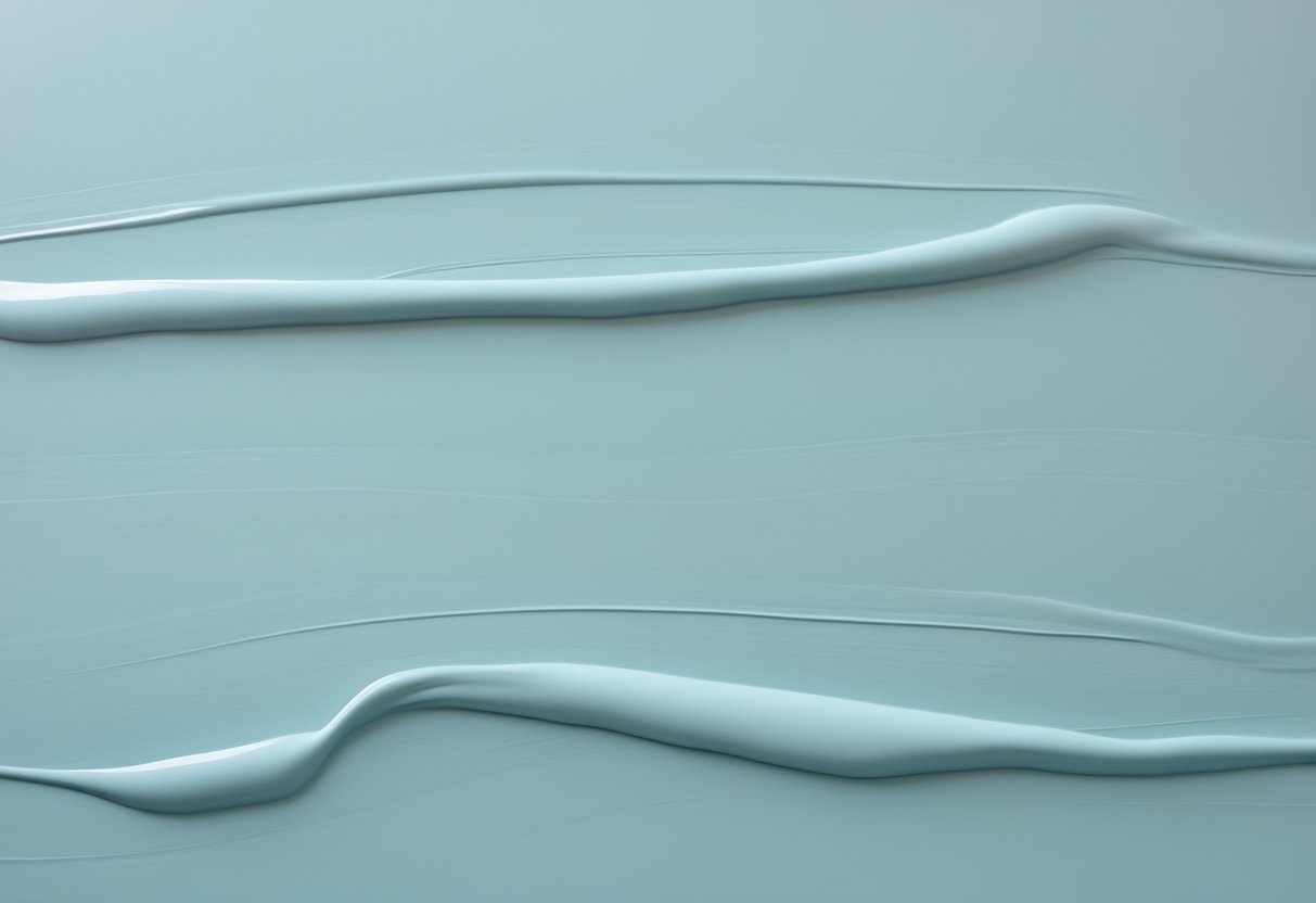
Sea Salt by Sherwin-Williams has earned attention for its soft mix of green and blue tones that create a calm and balanced look. Many homeowners choose it for its ability to shift slightly with the light, appearing cooler or warmer depending on the time of day. This quality makes it a flexible choice for a wide range of rooms and styles.
Designers often notice how this shade adds a clean, relaxed atmosphere without feeling dull or overly bright. Its subtle color works well in both coastal and modern homes, offering a gentle backdrop that complements natural light and simple décor.
The Deep Undertones that Make Sea Salt Stand Out
Sea Salt combines green, gray, and blue tones that shift with changing light. This mix gives it a balanced and adaptable look that works in many spaces. The color’s subtle movement through the day adds depth without feeling heavy or bold.
In bright morning light, its green undertones become stronger. Rooms feel open and lively, making this time of day ideal for kitchens, bathrooms, or work areas. The color reflects freshness and helps boost focus.
If you like the idea of a soft coastal look but want to see how darker contrast can change the mood, the article on Sherwin-Williams Peppercorn shows how a deep charcoal-gray can work as a strong accent without feeling harsh.
As daylight fades, blue and gray tones take the lead. Softer lighting highlights the cooler side of the color, creating a calm and restful mood. This makes it a good choice for bedrooms or living rooms where people want to unwind.
| Detail | Value | Description |
|---|---|---|
| Paint Name | Sea Salt | Signature color by Sherwin-Williams |
| Color Code | SW 6204 | Official reference number |
| Light Reflectance Value (LRV) | 63 | Reflects about 63% of light, offering a balanced brightness |
| RGB Values | 205 / 210 / 202 | Digital color representation |
| Hex Code | #CDD2CA | Web color format |
This color’s strength lies in its versatility. It adjusts easily to both natural and artificial light, allowing walls to appear slightly different throughout the day. One wall may show a greener tint, while another reveals a cooler blue-gray tone.
People often choose Sea Salt because it feels calm yet refined. It doesn’t overpower a room but instead supports other design elements. The hue’s quiet presence makes it suitable for modern, coastal, or traditional spaces alike.
Its shifting undertones create interest without distraction. This gentle movement of color helps rooms feel natural, balanced, and easy to live in.
How Does Sea Salt Affect the Feel of a Room?
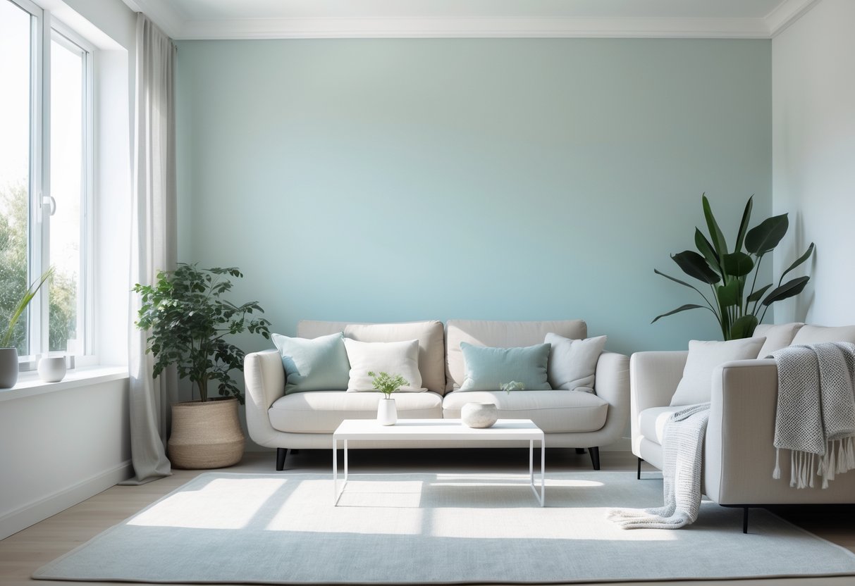
Sea Salt gives rooms a soft, balanced atmosphere that feels calm and open. Its gentle mix of green and blue tones helps create a relaxed setting that suits both large and small spaces. The shade makes walls seem to move back slightly, which can make a room appear wider and less crowded.
During the day, light changes how Sea Salt looks.
- In bright morning light, its green tones appear stronger, giving the space a clean and airy feel.
- As daylight fades, the blue tones become more noticeable, adding a quiet and soothing mood.
This color’s ability to shift with natural light helps rooms feel dynamic yet steady. The result is a space that supports rest and comfort without feeling dull or static.
| Time of Day | Main Tone | Mood Created |
|---|---|---|
| Morning | Green | Fresh and light |
| Afternoon | Balanced | Calm and open |
| Evening | Blue | Peaceful and cool |
People often say Sea Salt makes a room feel like a gentle retreat. It encourages slower movement and easier breathing, helping the space feel both welcoming and restful.
For a lighter, airy complement to Sea Salt, our guide on Sherwin-Williams Upward explores how that soft blue-gray can lend a calm, adaptable backdrop that flows across modern and coastal interiors.
What Makes Sea Salt a Great Choice for Any Space?
Sea Salt offers a balanced look that fits easily in many rooms. It adds color without becoming the main focus, which makes it useful for both small and large areas. Many people use it in living rooms, kitchens, bedrooms, and offices because it feels calm and flexible.
This shade works with a wide range of styles.
- In coastal homes, it blends smoothly with natural light and ocean tones.
- In farmhouse designs, it supports wood textures and vintage accents.
- In modern interiors, it softens sharp lines and cool materials.
| Style Type | How Sea Salt Fits |
|---|---|
| Coastal | Reflects soft beach tones |
| Farmhouse | Balances rustic wood and white trim |
| Modern | Adds warmth to clean, simple layouts |
Sea Salt’s quiet depth separates it from plain neutrals. While white or beige can seem flat, this color shifts slightly through the day, creating gentle variation. That movement keeps rooms from feeling dull.
In bedrooms, it supports a calm mood that helps with rest. In active spaces like family rooms, it stays in the background while letting furniture and decor stand out. Its steady tone makes it a reliable option for nearly any setting.
How Sea Salt Works with Specific Décor Elements
Sea Salt pairs well with many furniture styles. White furniture looks brighter and more defined, while dark woods appear rich but not heavy. Navy upholstery gives a calm, coastal tone, and brown or black leather adds balance to the paint’s cool undertones.
For window treatments, light fabrics such as white or cream linen keep the room airy. Navy or charcoal curtains bring contrast and depth, fitting well in workspaces or dining areas.
Artwork and wall décor stand out against Sea Salt’s subtle hue. A simple table helps guide choices:
| Décor Type | Works Well With Sea Salt |
|---|---|
| Black & white photos | Crisp and clean look |
| Colorful art | Soft, balanced background |
| Natural wood frames | Adds organic warmth |
| Brass or gold frames | Brings gentle glow |
Lighting influences how the color reads. Warm bulbs highlight green tones, while brass or copper fixtures add warmth. White or cream lampshades keep the wall color true.
Accent colors like coral, yellow, navy, or charcoal shift the mood easily. Metal finishes such as brushed nickel, chrome, or black metal complete the design with subtle contrast.
Top Spots to Use Sea Salt Around Your Home
1. Bathroom Spaces
Sea Salt adds a calm, airy look that fits well with the clean feel of a bathroom. Its soft green-blue tone keeps the space fresh and open.
Tips for use:
- Pair with white trim for a crisp contrast.
- Add natural wood accents for warmth.
- Works especially well in small bathrooms to make them appear larger.
| Element | Works Well With |
|---|---|
| Trim | Bright white |
| Flooring | Light gray tile |
| Accents | Wood, woven baskets |
2. Restful Bedrooms
This color helps bedrooms feel peaceful and balanced. The tone shifts slightly with the light—showing more green in daylight and more blue at night. That natural change keeps the room interesting while staying calm.
Simple combinations:
- White bedding and neutral curtains keep focus on the wall color.
- Soft lighting enhances the relaxing mood.
3. Kitchen Cabinet Ideas
Using Sea Salt on kitchen cabinets gives a gentle touch of color without making the space feel busy. It fits both modern and classic kitchens.
Design options:
- Paint only the lower cabinets in Sea Salt and keep the uppers white.
- Use the color on all cabinets for a unified look.
- Combine with white countertops and light walls for a clean finish.
| Finish Type | Recommended Pairing |
|---|---|
| Matte | Modern look |
| Semi-gloss | Easy to clean |
4. Shared Living Areas
Sea Salt works well in living rooms and open spaces where people gather. It offers a neutral backdrop that highlights furniture and décor without drawing too much attention.
Ideas to try:
- Mix with wood tones or woven textures for warmth.
- Use soft fabrics like linen or cotton to match the relaxed color.
- Keeps the space bright and welcoming throughout the day.
Flooring Options That Match Well with Sherwin-Williams’ Sea Salt
1. Pale Hardwood Floors
Light-toned woods such as oak, maple, or ash pair neatly with Sea Salt’s soft blue-green shade. These woods add gentle warmth that balances the paint’s cool undertones.
A simple table helps compare common choices:
| Wood Type | Tone | Effect with Sea Salt |
|---|---|---|
| Oak | Warm beige | Adds balance and comfort |
| Maple | Creamy light | Keeps the space bright |
| Ash | Neutral pale | Enhances open feel |
This mix of warm wood and cool wall color creates rooms that feel calm yet inviting.
2. Faded or Whitewashed Woods
Whitewashed or bleached flooring gives a coastal or airy style that works well with Sea Salt. The pale surface reflects light, allowing the wall color to shift slightly as daylight changes.
These floors keep the space open and relaxed. For a subtle beach effect, choose finishes with a matte or low-gloss look.
3. Soft Neutral Carpets
Carpets in beige, greige, or light gray tones blend smoothly with Sea Salt walls. They keep the design simple and modern without adding heavy contrast.
Use this quick guide:
- Beige: Warm and natural, pairs with coastal themes
- Greige: Balanced mix of gray and beige for flexibility
- Light gray: Cool tone that highlights Sea Salt’s green hints
Avoid carpets with strong yellow or gold undertones, which can clash with the wall color’s cooler base.
4. Cool Gray Tile Flooring
In kitchens or bathrooms, light to medium gray tiles provide a clean, modern background. The gray tones echo the subtle gray present in Sea Salt, creating a unified look.
Tiles with a matte or stone finish prevent glare and maintain a soft, even tone. This combination suits both small and large spaces by keeping the room feeling open and balanced.
5. Floors That Clash with Sea Salt
Very dark woods like walnut or cherry can overpower Sea Salt’s gentle color. The sharp contrast may make the walls appear faded.
Floors with red or orange hues also tend to conflict with the paint’s cool base. Choosing flooring with neutral or light undertones keeps the wall color clear and consistent.
Sea Salt Compared to Other Sherwin-Williams Shades
Sea Salt (SW 6204) blends blue, green, and gray tones in a balanced way. It suits many rooms, especially bathrooms and bedrooms, because it shifts gently with different lighting.
| Color | Main Difference | Best Use | Impression |
|---|---|---|---|
| Sea Salt (SW 6204) | Balanced mix of blue, green, and gray | Versatile spaces | Adapts easily to light changes |
| Rainwashed (SW 6211) | Has more blue than Sea Salt | Areas needing a brighter blue tone | Feels slightly more colorful and less neutral |
| Comfort Gray (SW 6205) | Shows stronger green and gray tones | Rooms needing a calm, natural mood | Brings an earthy, soft look |
| Silver Strand (SW 7057) | Leans more gray with muted color | Modern, simple interiors | Offers a subtle, refined appearance |
Testing samples in various light helps reveal each color’s true character.
Conclusion
Sea Salt offers a balanced mix of blue, green, and gray tones that blend easily with multiple design styles. Its soft appearance allows it to fit in both bright and shaded rooms, adapting to different lighting throughout the day. Many homeowners find that it brings a calm and inviting atmosphere without feeling dull or cold.
To decide if it fits a space, it helps to test a small sample on the wall. Observe the color in morning, afternoon, and evening light. This simple step can show how the shade shifts and whether it complements existing furniture or décor.
Key benefits of using Sea Salt:
- Matches well with neutral and natural materials
- Works in bedrooms, bathrooms, and living areas
- Reflects light softly without glare
- Offers a clean, modern look without harsh tones
| Feature | Description |
|---|---|
| Tone | Soft mix of blue, green, and gray |
| Finish | Smooth and adaptable |
| Best Use | Interior walls and accent spaces |
| Effect | Creates a relaxed and balanced mood |
Those exploring other paint options may find Swiss Coffee by Sherwin-Williams to be another flexible choice. It provides a warm, creamy tone that pairs well with both light and dark accents.
The insights shared by Alex Guerrero, a seasoned designer with a background in fine arts and color theory, highlight the value of thoughtful color selection. His experience in art and design supports the idea that the right paint choice can subtly transform a home into a more comfortable and cohesive space.