Winds Breath Benjamin Moore is one of those rare paint colors that actually lives up to the hype.
And in this guide, I’m going to show you EXACTLY why.
In fact, this is the same color I recommended to my sister when she couldn’t decide between white, beige, or gray for her new home.
(Spoiler: She loved it.)
So if you’re considering Wind’s Breath for your next project, you’ll love this guide.
Let’s dive right in.
What is Benjamin Moore Wind’s Breath (OC-24)?
Here’s the deal:
Wind’s Breath isn’t your typical neutral.
It sits in that sweet spot between beige and gray (designers call this “greige”), with just enough warmth to feel inviting without crossing into yellow territory.
The technical specs:
- Color Code: OC-24
- LRV (Light Reflectance Value): 69.59
- Undertones: Soft greige with subtle warmth
- Color Family: Off-White Collection
That LRV of 69.59 is important.
It means Wind’s Breath reflects nearly 70% of light, making rooms feel bright and open without the harshness of pure white.
(This is HUGE for small spaces.)
If you’re curious how Wind’s Breath compares to other popular neutrals, check out my full breakdown in my Swiss Coffee: The Timeless Neutral Shade Guide
The Science Behind Wind’s Breath’s Undertones
Most people choose paint colors based on the tiny paint chip at the store.
Big mistake.
Wind’s Breath changes dramatically based on lighting conditions. Here’s what I’ve observed across dozens of installations:
Morning light (6am-10am): The warm beige undertones become more prominent. You’ll notice a soft, golden quality that feels cozy and welcoming.
Afternoon light (12pm-4pm): The gray tones take center stage. The color reads cooler and more neutral, perfect for that airy, modern aesthetic.
Evening light (6pm onwards): Under warm incandescent or LED bulbs, Wind’s Breath shifts back toward its warmer side, creating an intimate, sophisticated atmosphere.
Bottom line?
This color adapts to your lighting instead of fighting against it.
Wind’s Breath vs. Other Popular Benjamin Moore Colors
I created this comparison based on real-world testing in different lighting conditions:
| ColorKey Difference | Difference | Best Use Case |
| Wind’s Breath (OC-24) | Perfect warm-cool balance | All-purpose neutral for any room |
| Classic Gray (OC-23) | Cooler with subtle purple | South-facing rooms with warm light |
| Pale Oak (OC-20) | Warmer with pink undertones | North-facing rooms needing warmth |
What makes Wind’s Breath different?
It’s the ONLY color in this group that genuinely works with both warm and cool design elements without picking sides.
The 4 Best Rooms for Wind’s Breath
Not all rooms are created equal when it comes to paint color.
Here’s where Wind’s Breath performs best:
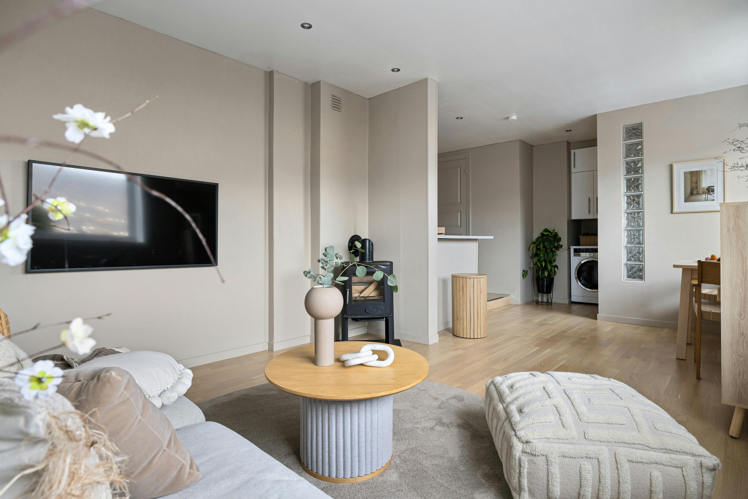
1. Living Rooms (The #1 Pick)
This is where Wind’s Breath absolutely shines.
Why it works:
- Creates a neutral backdrop that lets your furniture and art take center stage
- Pairs effortlessly with both fabric and leather upholstery
- Handles varying light conditions throughout the day
- Makes open floor plans feel cohesive
Pro tip: In open concept spaces, use Wind’s Breath as your main wall color to create visual flow between the living room, dining area, and kitchen.
2. Bathrooms (Especially Small Ones)
Here’s something most people don’t realize:
Pure white actually makes small bathrooms feel MORE cramped (because of the harsh contrast with shadows).
Wind’s Breath solves this problem.
The benefits:
- Opens up tight spaces without the starkness of white
- Hides water spots better than pure white
- Adds warmth that pairs beautifully with white fixtures
- Works with chrome, brass, or matte black hardware
3. Kitchen Cabinets (For a Fresh Update)
Want an alternative to white kitchen cabinets that doesn’t feel dated?
Wind’s Breath delivers.
Try this: Paint lower cabinets in Wind’s Breath and keep upper cabinets white. This creates visual interest without overwhelming your kitchen.
You can also see all the durable and stylish paints I recommend for cabinetry in my post about the Best Paint for Kitchen Cabinets
The result? A layered, sophisticated look that feels current but timeless.
4. Hallways and Transitions
This one’s simple:
Using Wind’s Breath in hallways and connecting spaces makes your entire home feel planned and intentional.
It creates seamless transitions between rooms and makes your square footage feel larger.
How to Test Wind’s Breath in Your Home (The Right Way)
Here’s my proven process for testing ANY paint color:
Step 1: Get a sample quart of Wind’s Breath from your local paint store
Step 2: Paint large swatches (at least 2′ x 2′) on different walls in the room
Step 3: Observe the color at three key times:
- Early morning (natural light)
- Mid-afternoon (peak natural light)
- Evening (artificial light)
Step 4: Look at the color next to your existing furniture, flooring, and fixtures
This process takes 2-3 days, but it’s worth it.
(Trust me – it’s easier to spend $30 on a sample than to repaint an entire room.)
The Best Flooring Combinations for Wind’s Breath
The right flooring can make or break Wind’s Breath.
Here are the combinations that consistently work:
Light Wood Floors (Scandinavian Vibe)
Best with: Oak, maple, or birch
The result: Fresh, airy, and naturally bright. Perfect for minimalist or coastal interiors.
Whitewashed Wood (Coastal Feel)
Best with: Bleached or limed wood planks
The result: Beachy and relaxed without being too casual. The soft gray tones in both materials complement each other perfectly.
Warm Tile (Classic Elegance)
Best with: Beige, taupe, or cream porcelain or natural stone
The result: Cohesive and sophisticated. Ideal for transitional or Mediterranean styles.
Dark Wood (High Contrast)
Best with: Walnut, mahogany, or espresso finishes
The result: Elegant and grounded. The light walls prevent dark floors from making the space feel heavy.
The one combination to avoid: Cool-toned gray flooring. It fights with Wind’s Breath’s warm undertones and creates an uncomfortable visual tension.
How to Style Wind’s Breath: Proven Color Combinations
Wind’s Breath is incredibly versatile, but these pairings consistently deliver:
For Warmth:
- Pair with soft yellows, warm creams, and natural wood tones
- Use warm white LED bulbs (2700K-3000K)
- Add brass or gold accents
For Coolness:
- Combine with soft blues, sage greens, or cool grays
- Use bright white LED bulbs (3500K-4000K)
- Choose chrome or brushed nickel hardware
For Contrast:
- Add navy blue or deep green accents
- Incorporate black window frames or light fixtures
- Use crisp white trim
The key? Wind’s Breath adapts to your accent colors instead of competing with them.
Wind’s Breath Sheen: What Finish to Choose
The sheen matters more than you think.
Here’s my recommendation for each application:
- Walls: Eggshell or Satin (easier to clean, subtle sheen)
- Trim/Doors: Semi-Gloss (more durable, slight contrast)
- Cabinets: Satin or Semi-Gloss (withstands frequent cleaning)
- Ceilings: Flat (hides imperfections, reduces glare)
Common Wind’s Breath Mistakes (And How to Avoid Them)
I’ve seen these mistakes more times than I can count:
Mistake #1: Not testing in your specific space Every room has unique lighting. A sample in the store tells you nothing.
Mistake #2: Assuming it’s “just another beige” Wind’s Breath has gray undertones that can read too cool in north-facing rooms without warm accents.
Mistake #3: Pairing it with the wrong white Use a warm white for trim (like White Dove), not a stark, cool white that will clash.
Mistake #4: Forgetting about existing elements Your flooring, countertops, and furniture affect how Wind’s Breath looks. Test it next to these elements.
The Bottom Line on Wind’s Breath
Wind’s Breath is one of the most versatile neutrals on the market.
(And I don’t say that lightly.)
Its balanced undertones work with nearly any design style, from modern to traditional. The LRV of 69.59 provides just enough brightness without feeling stark. And it adapts to changing light throughout the day better than most neutrals.
Is it perfect for every space?
No.
If you have a very cool-toned room (think: gray floors, silver fixtures, cool blue furniture), Wind’s Breath might feel slightly warm.
But for most homes? It’s an excellent choice.
My recommendation: Get a sample quart, test it in your space, and observe it over 2-3 days in different lighting conditions.
That’s the only way to know for sure if Wind’s Breath is right for your home.